P5 - Conduct testing on the finished interactive media product
|
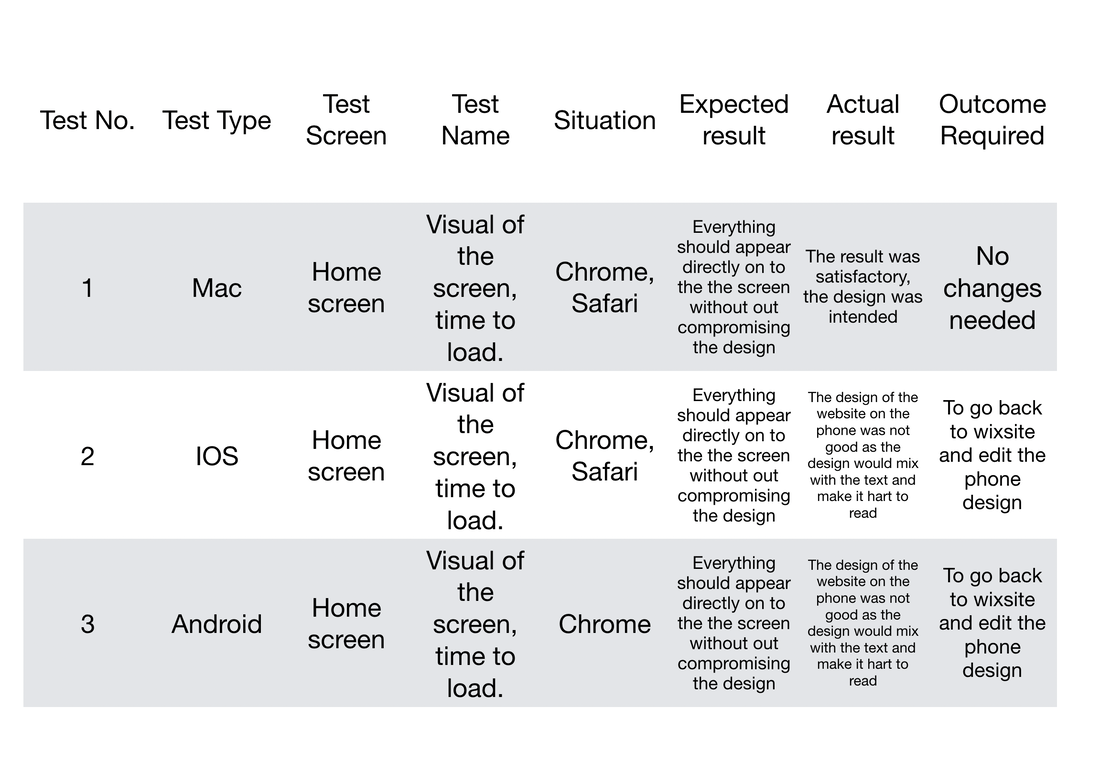
For the testing of my website, I used several different devices and operating systems which are the most likely to be used by the audience. - Mac Chrome - Mac Safari - Iphone Chrome - Iphone safari - Android Chrome The results from my testing the website on different devises and platforms is to the right. |
|
Feedback on the website
|
Feedback
Strengths - One of the strengths I received for my website was the features I included such as the live chat feature which is capable of giving the ability for the consumer to contact me through the chat today, my peers said that the live chat feature game a more interactive feeling for the audience. Another strength that I was given was the way I placed my text on the website, my peers described this as nice and organised, in my opinion I prefer seeing information in middle of the page as it feels more organised. Video background are used in my website was found to be a strength for my product as it makes the website look more modern and lively. Weaknesses - There are also many weaknesses that my website had, for example one of them was my title did not look very attractive because of the colour scheme I chose it was white and black. They suggested for me to change the font to the colour purple. Another weakness to my website had was the different variation in font colours and sizes, this was a weakness as it would make the website look unprofessional and inconsistent with the design. I was also informed to improve the user interface which didn't offer many buttons and lastly to change the performance page as it did not include much information and it had strange names for the performers. |
|
Improvements made - After I received my improvements for my website as the video shows, I changed a few of the mistakes and followed their advice. Firstly I changed the dark themed title I had and changed it for a purple themed font as my classmate described in to be more colourful and presentable for the audience. Something else I changed were the different fonts and sizes I had for my text in the websites, I made sure to this because it made my website look unprofessional and disorganised. Another thing I changed was adding more user interface and more interactive features such as the map, this would help my website look more like other similar products out there for the public. Lastly I made sure to give the performers realistic names and background information for the website in case the audience would want to know anything about the performers, this was also something else that was recommended to me by my peers.
