P4 - Create the media components to be used in the planned campaign
|
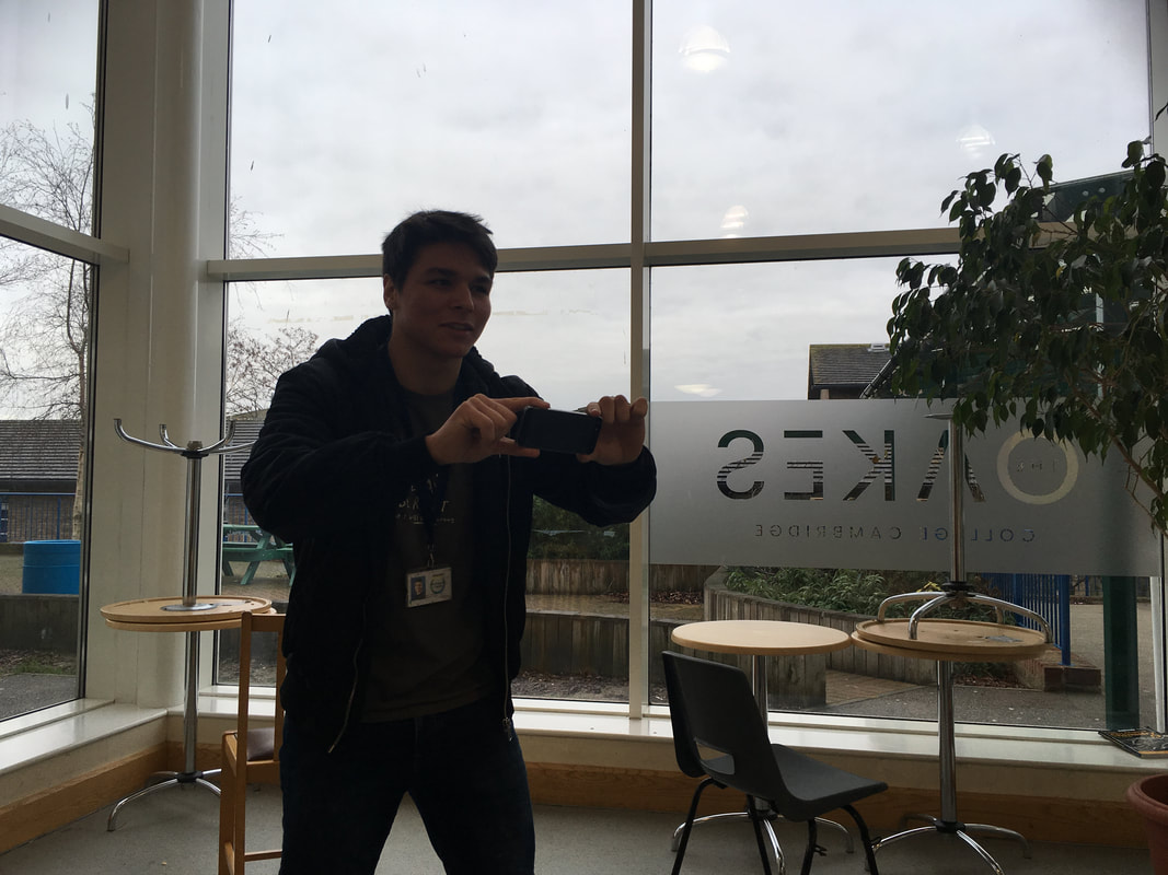
During the shooting of my advertisement, I considered the possibility of filming with a Sony camera instead of my phone, but because of compatibility issues bridging the camera and my laptop which I use to edit, I decided to use my phone camera instead as it can film in 1080p 60fps with an automatic stabiliser. For the advert, this should suffice for the entire production.
|
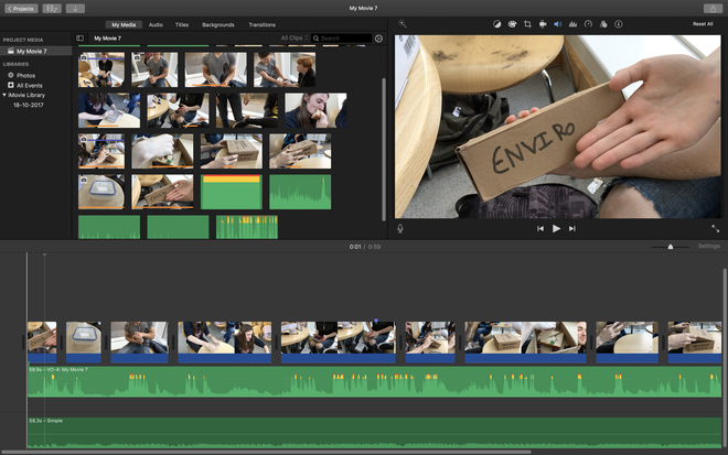
For editing the production and finalising it. I uploaded it to my pre-installed application iMovie as it is very effective and reliant for those of us using Apple products. The film taken from the production was reduced from originally 3 minutes to 1 minute as I aim for my advert to be quick and rememberable. Within the application I used the cutting tool to shorten and place together videos.
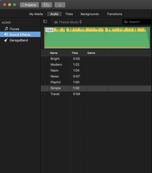
For the recording of my voice, I used the built in feature that plays the edited video and records audio simultaneously. This allowed me to better place speech within the video. At last I used iMovies free music for the background music to accompany my lines.
For the recording of my voice, I used the built in feature that plays the edited video and records audio simultaneously. This allowed me to better place speech within the video. At last I used iMovies free music for the background music to accompany my lines.
|
|
Online Edit
Here is the final product of my advert. It has been posted on Youtube as the website doesn't allow me to upload and post mp4 video.
Flyer
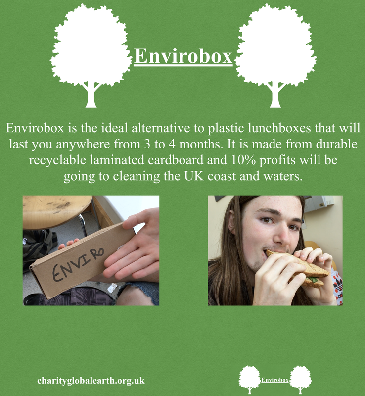
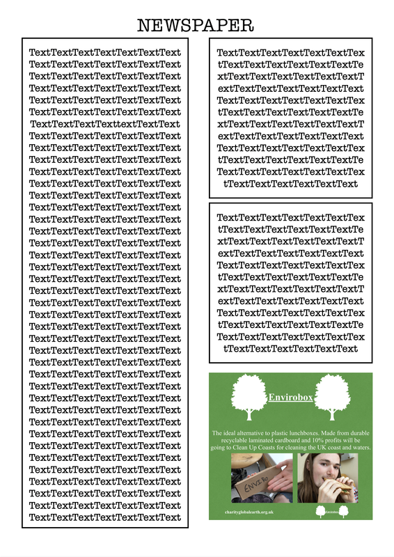
Here below is the flyer that I will be using to market my product. It contains images of trees to symbolise nature, picture of the product for the audience to capture the look of new innovative lunch box and a photo taken of a pleased customer.
The flyer has the colours of green which can symbolise nature and the white within the text is being used for both allowing the customer to read the text effortlessly and symbolising peace.
The flyer has the colours of green which can symbolise nature and the white within the text is being used for both allowing the customer to read the text effortlessly and symbolising peace.
Bellow is the newspaper layout with my advert at the bottom. Much like my flyer, the green of the advert will stand out to those that prioritise nature and environmentalism within themselves. The advert is large enough to have the writing be visible for the reader and possibly larger than the newspaper's text.
M3. Explain how the required codes and conventions have been met when creating your media advertising components
|
Before I started my cross-media advert for my Envirobox, I followed some of the examples that other companies use when selling and advertising their own products. One of the trends I found when companies are selling and advertising their own products is that they focus the majority of their time making both the advert and the product seem very appealing visually for the consumers. Companies like Apple hire some of the best production studios for their adverts as they rely on the advert to be very pleasurable to the eye instead of focusing on the product’s hardware and specifications. Taking from this example is why I decided to ensure that my product has the colours needed to be associated with nature which tends to be perceived as clean and beautiful. The use of visual pleasure that seems so conventional when selling products will be implemented within all my cross-media advertising methods such as audiovisual advert and printed advert. To maintain the audience’s attention once they have seen the advert’s visuals, I will be including enough information for it to be remembered easily. The information I included on the printed advert is three short lines giving the reader a small summary of the product.
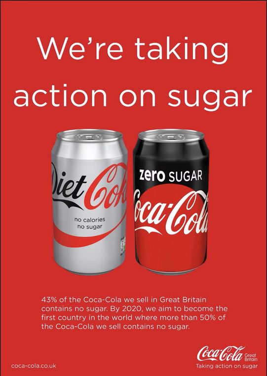
The codes and conventions in newspapers and flyers are usually a big image or title to be displayed on the small given panel. If the advert catches the attention of the reader, the company places small text with some details of the product or a short message for the reader to learn a bit more about the product. At the bottom there is an example of an advert from Coca-Cola on the newspaper, the advert is showing the same conventions I mentioned which is to place a big image or title to capture the attention of the reader and if interested the reader can read the small text which contains their intended message. Depending on the product, the colour scheme is different as it’s supposed to associate itself with a meaning and message or company icon. As can be seen in this advert from Coca-Cola, their background image is red which helps the audience think of the iconic colour branding of Coca-Cola. Another convention for when distributing a flyers and newspaper adverts, adding information to find where to learn more about the product, for example, a webpage or social media is useful to gain a larger audience online. I have made sure to include this in my flyer and newspaper advert as placing info of the brand and website could draw in more consumers. |
|
The codes and conventions in making audio-visual adverts usually conforms with making the video at a maximum of 30 seconds on tv and 2 minutes online for social media and youtube. Making it this short length is necessary to do to the advert needing to deliver all the info in a summary and to keep the attention of the audience as the public tends to have short attention spans. As my advert is supposed to be distributed on Youtube and social media, my advert can be longer than a TV advert as there are no set time limits. Another convention is the use of visual and audio to be at high quality and sound clarity, as the audience will be viewing the advert online, the advert needs to have at least HD quality and clear sound, otherwise, it will make the product seem like it's from a bad quality company. Having the product is shown clearly on the screen and someone using it can give a better visualisation for the audience of what the product looks like and how it looks with someone. Having a soundtrack playing in the background is also necessary as it can help the audience understand what kind of product they will be purchasing. For example, I used an upbeat song that helps symbolise the good effects it has one the environment and on people’s lives. I also used some actors to better advertise the product, these actors were students from my college.
D2. Demonstrate how the technical and aesthetic properties of the media components meet the client brief
In the end I believe that my adverts such as the audio visuals and print have been a success as they followed many of the codes and conventions. My product clearly displays the colours I wanted to symbolise nature and the oceans. My audio-visual advert gives sufficient detail on how my lunch box is made from recycled, laminated cardboard and it is environmentally friendly. On my print advert I follow the example given by Coca-Cola which is to place a big image or title to capture the attention of the reader and if interested the reader can read the small text which contains their intended message, on my advert I have a big tile saying Envirobox with small text bellow giving a summary of details about the product. The colour layout on my advert shows the colours green, blue and brown to symbolise nature, this helps the audience better associate the product with my intended message which is to save the planet by recycling. Similar to the flyers, both adverts are eye-catching as they are using colours and images on the flyers for the public to read, the newspaper advert will be directing the interested consumers to my social media and website. The design of my flyer fits with the briefs description of being “fashionable, fun and friendly for the environment” because of the design.
In my audiovisual advert, I was the narrator reading out the details of how the Envirobox saves the planet and I gave details on how it is better for personal use compared to other lunch boxes on the market. Giving messages such as Envirobox’s profits are contributing to coast guards which means both cleaning up the coast and protecting it in the future which is the perfect message to encourage people to who wish to save the planet by being green to buy the product. For the production of the audiovisual advert, I ensured to follow similar conventions done by other production companies such as using different camera angles and having a narrator. Following these conventions have made my production look much more professional, this helps with the sales for my product as it gives the consumers more comfortable knowing there is a professional advert for the product. This meets the brief as I am stating the facts about the lunch box that was given to me in the brief.
My flyer and advert are quite similar, they both follow the conventions by Coca-Cola which is to place a big image or title which has proven to be successful for capturing the attention of the audience. Both are made to draw in the consumers to my social media and website which is where you can learn more about the companies goals and purchase the product. For greater success I will be distributing the flyers to different areas and selecting areas where there is a higher concentration of ABC1 consumers, this will increase the likelihood of my product reaching my target audience. ABC1 consumers can be found in large shopping centres where is also easy to hire someone to distribute the flyers.
To conclude my designs for the flyers, newspaper and audiovisual advert meet the client brief as I am adding the “fashionable, fun and friendly for the environment” elements that can be found in the design. My advert also shows many of the fact that were included in the brief such as donating to charity and the material the lunchbox is made from.
